Project Overview
View the full case study in my portfolio.
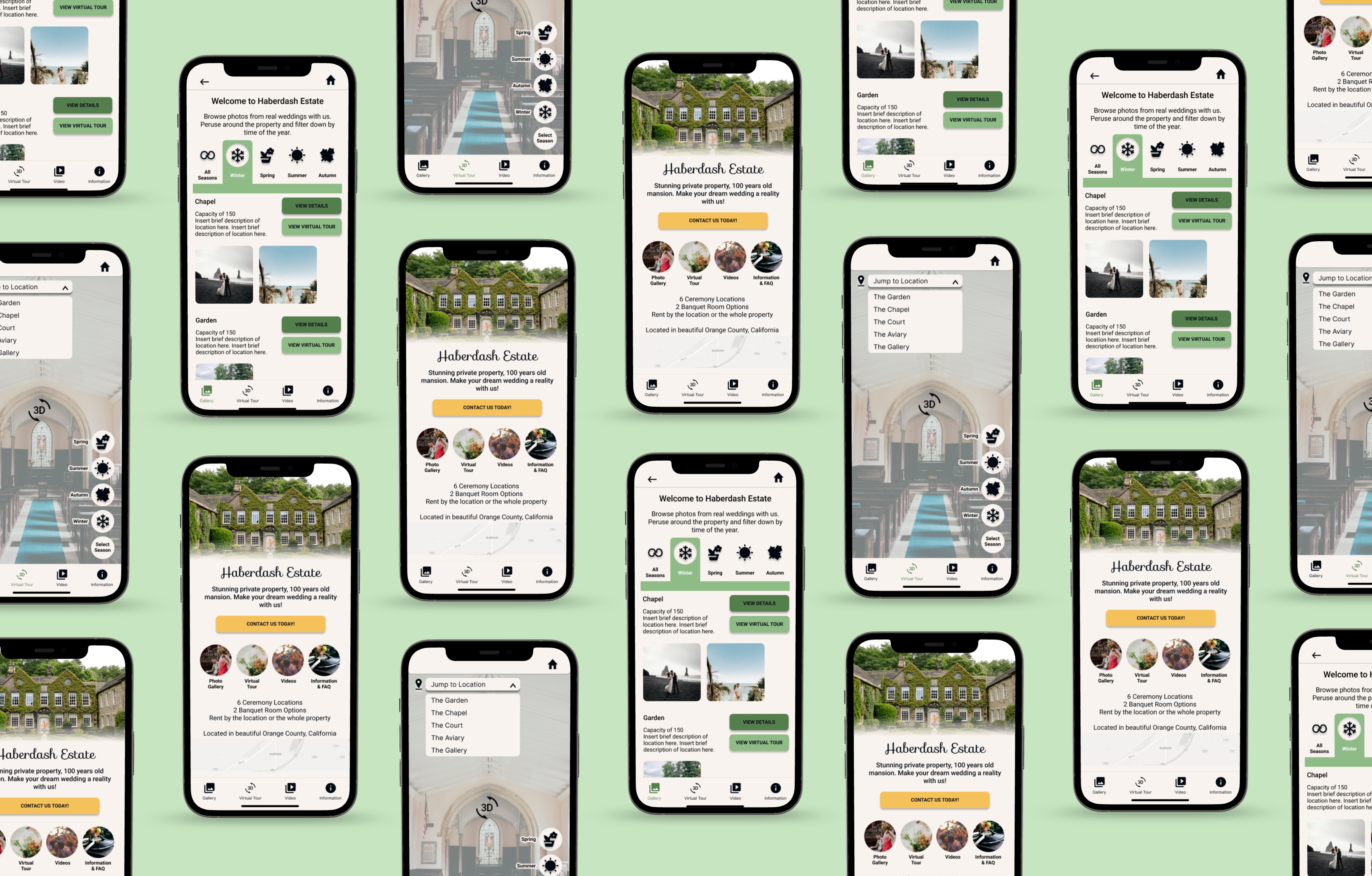
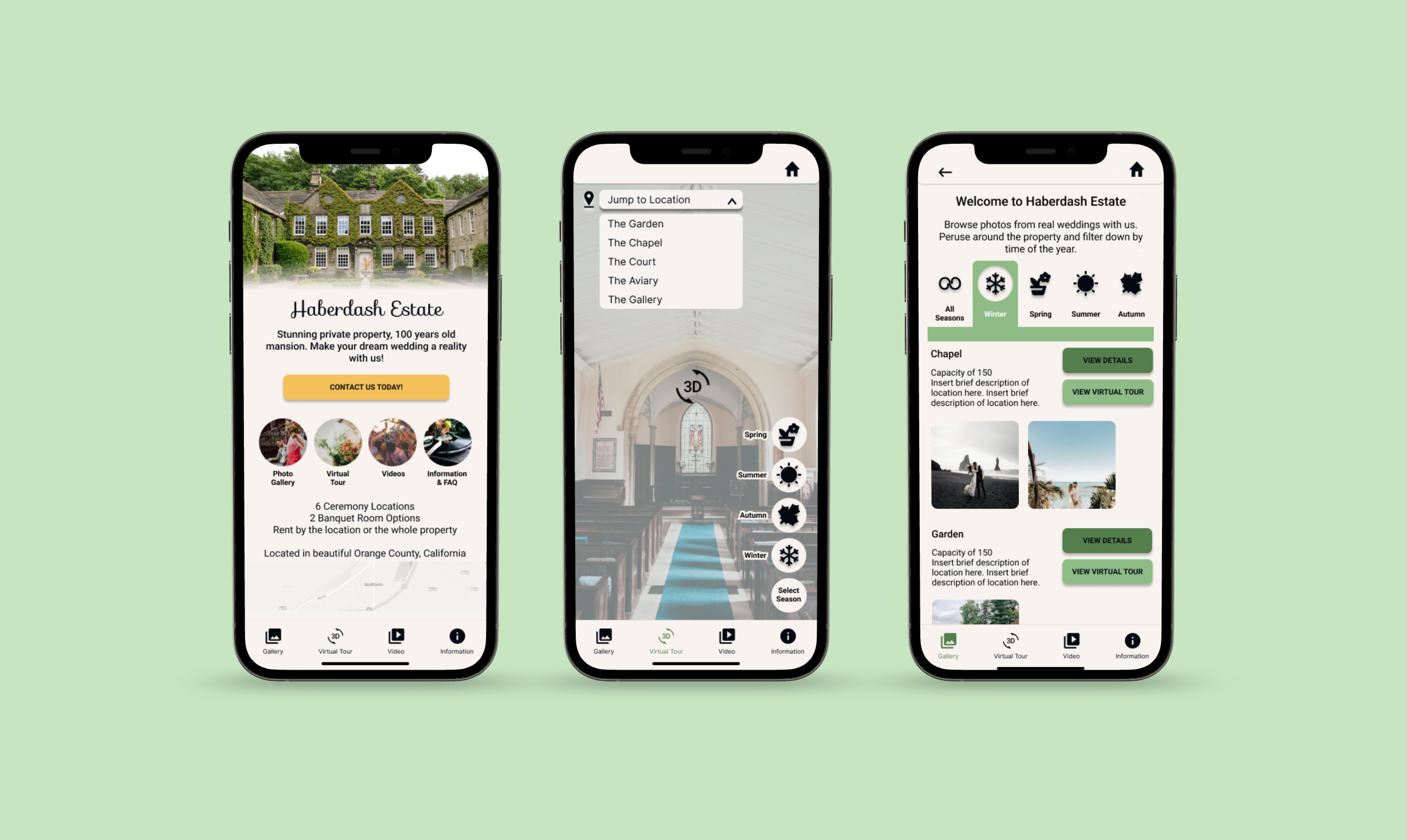
Haberdash Estate wedding venue app enables customers to have an immersive virtual tour of the property from the comfort of their home, saving them time, money and avoiding any surprises.
This is a student project for the Google UX Design Certificate. Haberdash Estate is a fictional wedding venue created to fit the brief “Design a virtual tour app for a trendy wedding venue.”
Problem
Haberdash Estate lacks online presence and needs a way for out-of-town customers to view and tour the property without having to visit in person.
The User
This project was designed with secondary research statistics in mind. Articles from Forbes and Wedding Planner Institute confirmed that almost 70% of couples getting married choose a venue themselves, while 30% rely on professional for help for day-of-wedding needs
Alaina / 27 / Social Media Marketer
Goals:
- Find the perfect destination wedding venue
- Avoid costly and time consuming traveling
- Have a beautiful and memorable wedding
Frustrations:
- Visiting venues in person is time consuming and costly
- Images online aren’t reliable or always up to date
Pain Points
- Location: Traveling to view multiple venues in person is inconvenient
- Investment: Paying for travel or taking time to make in person visits is costly
- Reliability: Venue photographs can be deceptive and not show the full reality of what’s in each space
- Accessibility: Considerations such as wheelchair ramps aren’t made clear through online descriptions
Design & User Testing
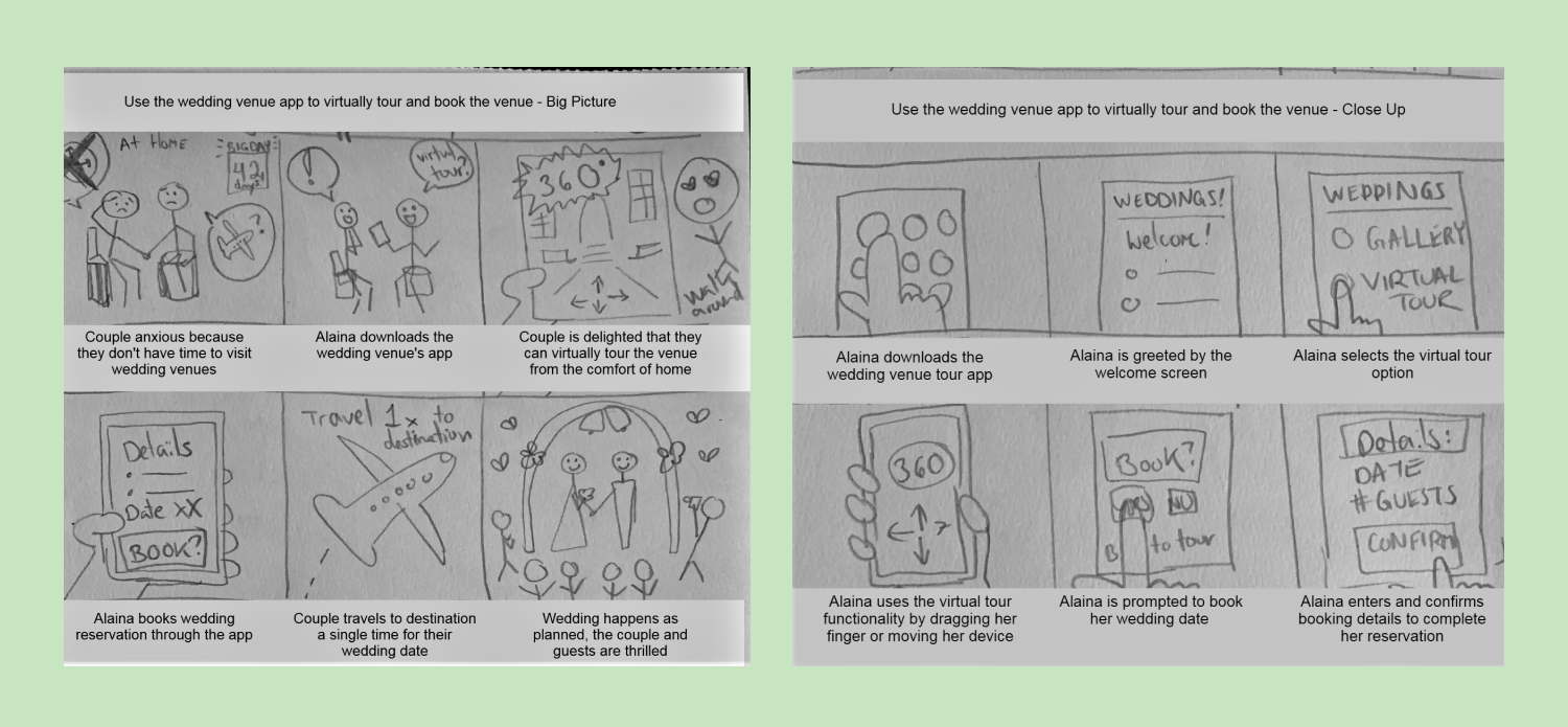
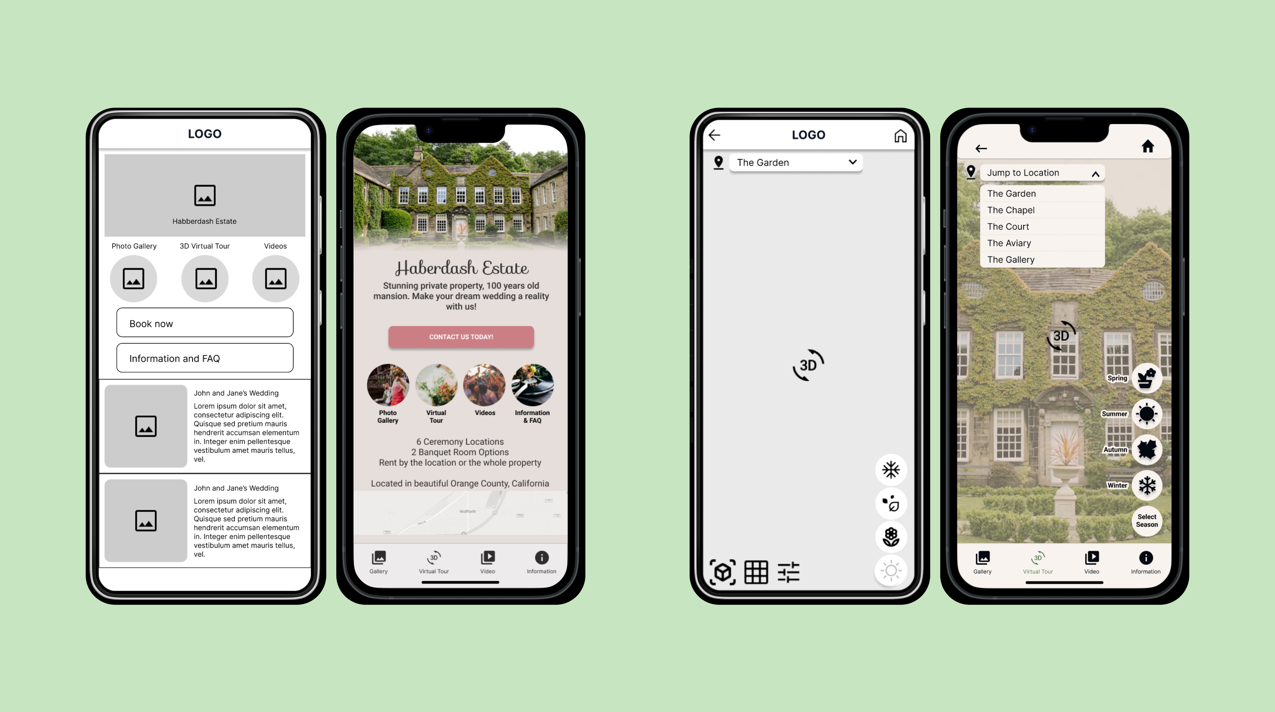
Lo-fi Wireframing and Prototyping
Early designs offered an abundance of imagery and content, but feedback exposed the need for more convenient navigation and concise displays of information.
Usability Study
User testing involved 5 participants who fit the persona. Four tests were moderated with screen share, one was unmoderated.
“I would never use the View by Couple section; everything I need is in the View by Location.” - Participant A
“Book now is too firm, I would rather it say Inquire or contact us” - Participant B
“Having done a lot of venue shopping, this seems like a realistic form I would have to fill out.” - Participant C
“I would already know the season or date of the wedding, the amount of people of coming, and my budget. I would expect all three of those to be answered upon visiting this app.” - Participant D
Findings included:
- Users want to view key information at a glance
- Users prefer quality over quantity in viewing and filtering options
- Iconography left unlabeled causes confusion
Hi-Fidelity Wireframing and Prototyping
User testing proved extremely helpful and resulted in many changes, particularly of the home screen, navigation, and the gallery page. Mainly, a navigation bar was added as a fixed featured on all pages of the app.
Accessibility Concerns
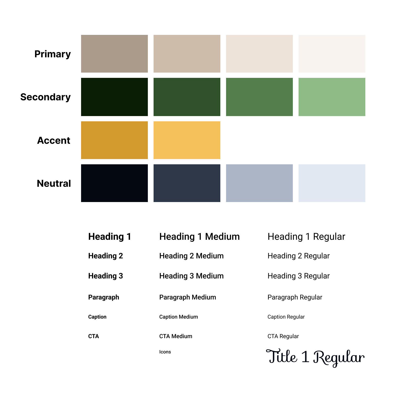
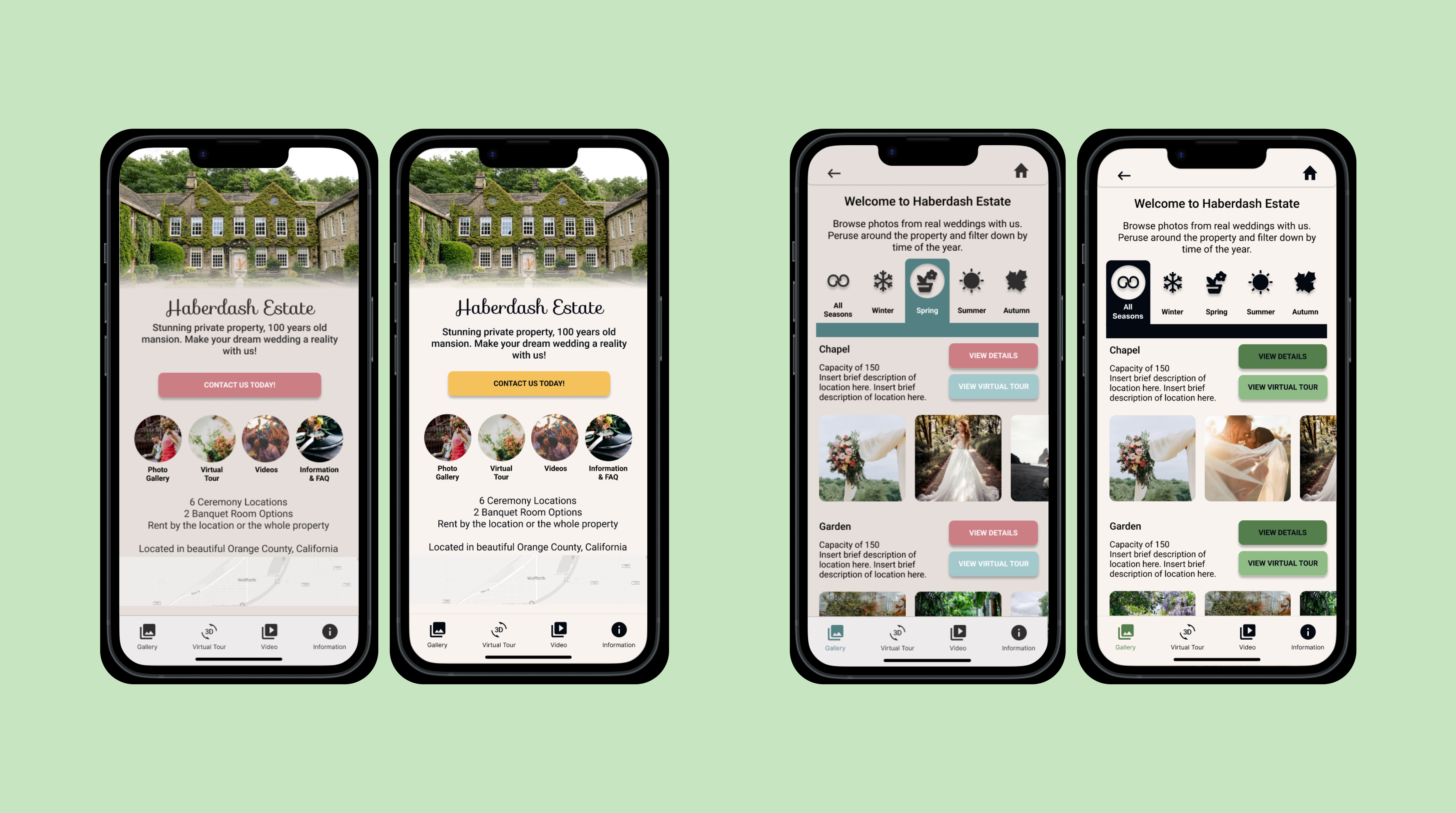
The colors initially used fit the brief and mood board, but concerns were brought up about visibility considerations. A contrast ratio test was performed and the design failed.
During additional testing, users also expressed confusion at the use of colors on buttons. Inconsistent usage of colors lead to users feeling directionless. The color hierarchy needed to be reconsidered.
Final Product and Learnings
With the final designs finished, this fulfilled the assignment needed for the Google UX Certificate course.
As this was my first project in the course, I experienced the steepest learning curve and spent countless hours working on the project. Throughout the process the part I was most surprised by was the usability testing. Through the learnings from each test, the product improved and transformed for the better tenfold.
