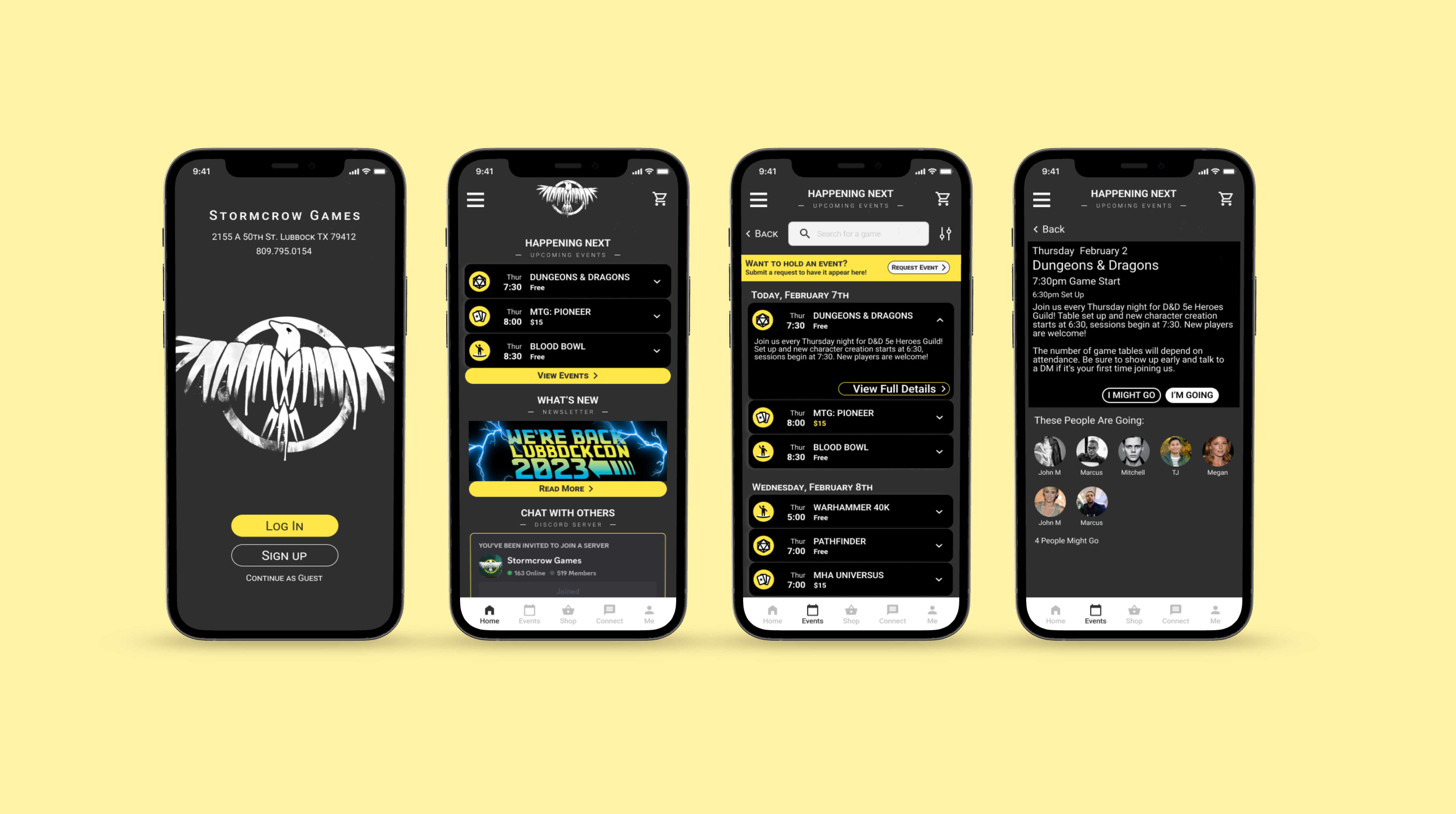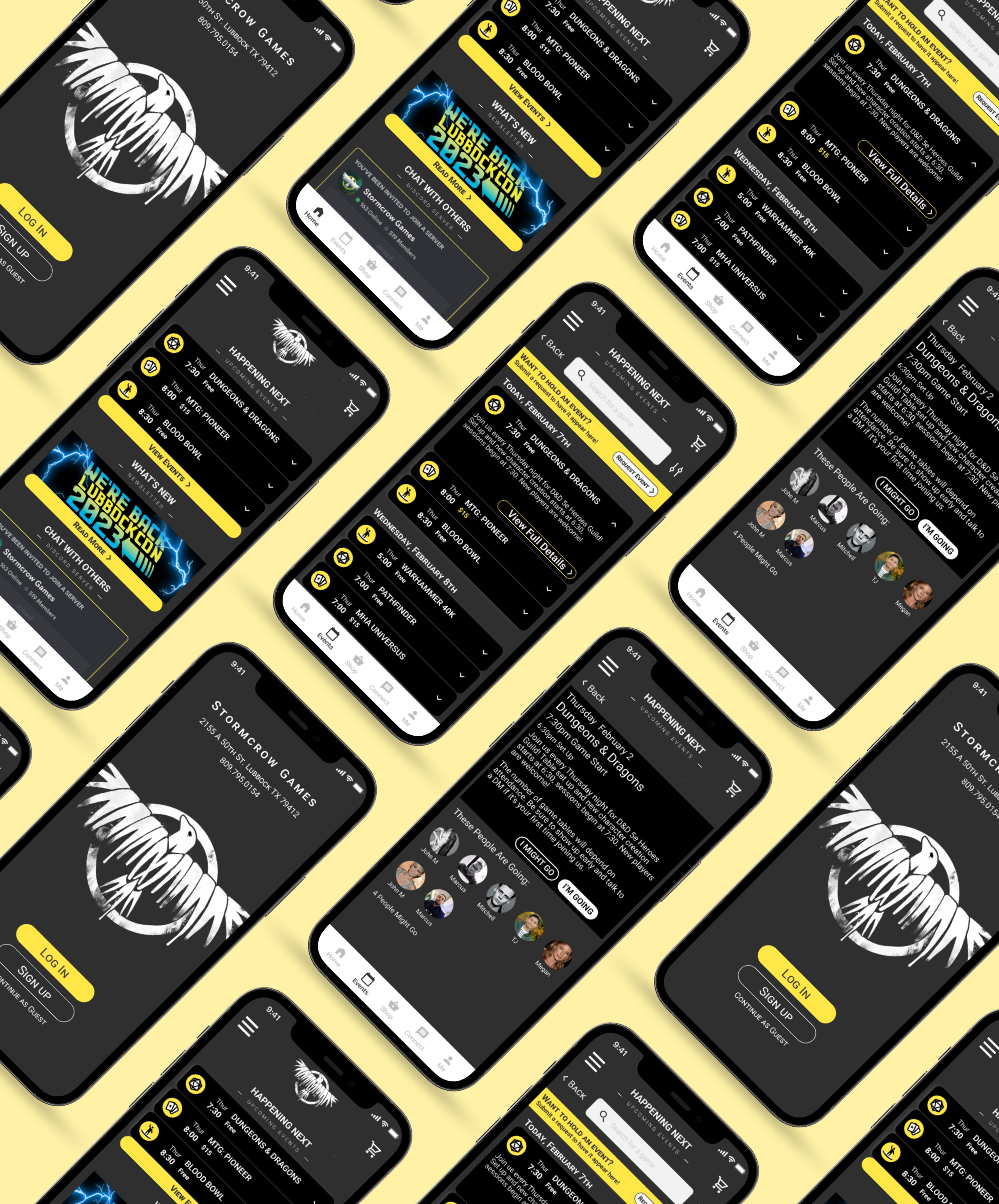
Project Overview
View the full case study in my portfolio.
The refreshed Stormcrow Games website and new companion app serve players of all kinds through clear messaging, front and center event listings and highlighting community lead discussions.
This project was done in part for my Google UX Design certificate. Rather than choosing a fictitious prompt, I chose to work with a real client free of charge.
Problem
In-Store event information is split across many external resources.
- Community members are burdened with coordinating meetups and events
- Traffic is directed away from the website
- People interested in joining the community are directionless
The User
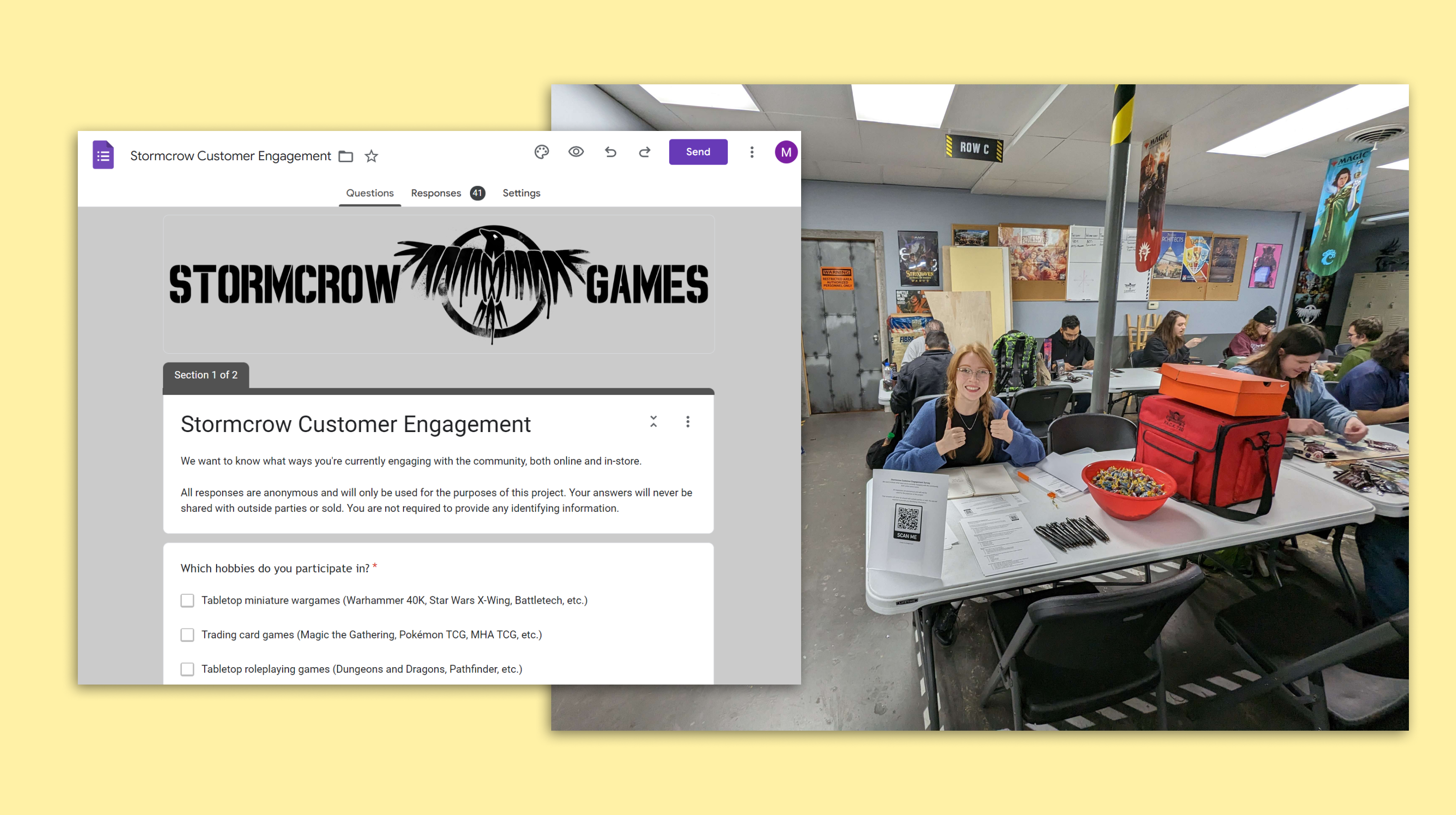
After meeting with the store owner I set up a table in the shop to interview and survey customers, as well as to later test my prototypes throughout the design process.
- In-person interviews conducted: 7
- Written surveys completed: 41
Customer Pain Points
- Event Scheduling: The burden of coordinating, scheduling and promoting in-store events weighs heavily on customers.
- Community Cliques: When breaking into a game group as a new member of the community, it’s difficult to know who to talk to or where to go first.
“Community involvement is important but it can’t always be on them to push/promote/host events as most have other other responsibilities they have to handle first.” - Survey Participant
Business Challenges
- Keeping things Current: Constantly posting updates on many message boards is timely and redundant
- Enabling the Community: The store cannot fully support coordinated events and meetups it doesn’t know about
“I don’t want to tell the community how to play the games. They should control what they play and when they want to play it.” - Owner
Design & User Testing
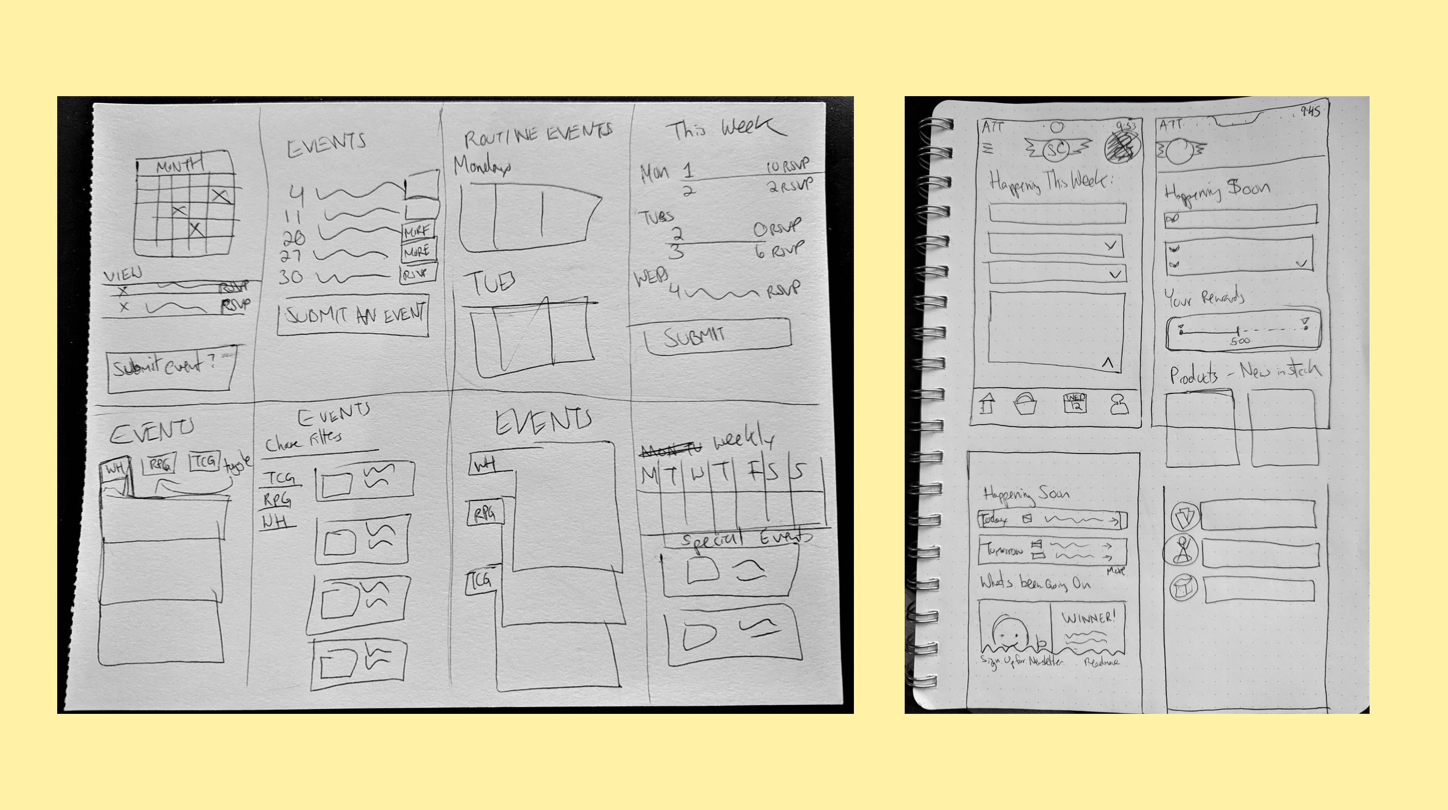
Wireframing & Prototyping
Working with a real client enabled me to use realistic content while wireframing. Considerations such as game titles and product names heavily impacted design choices.
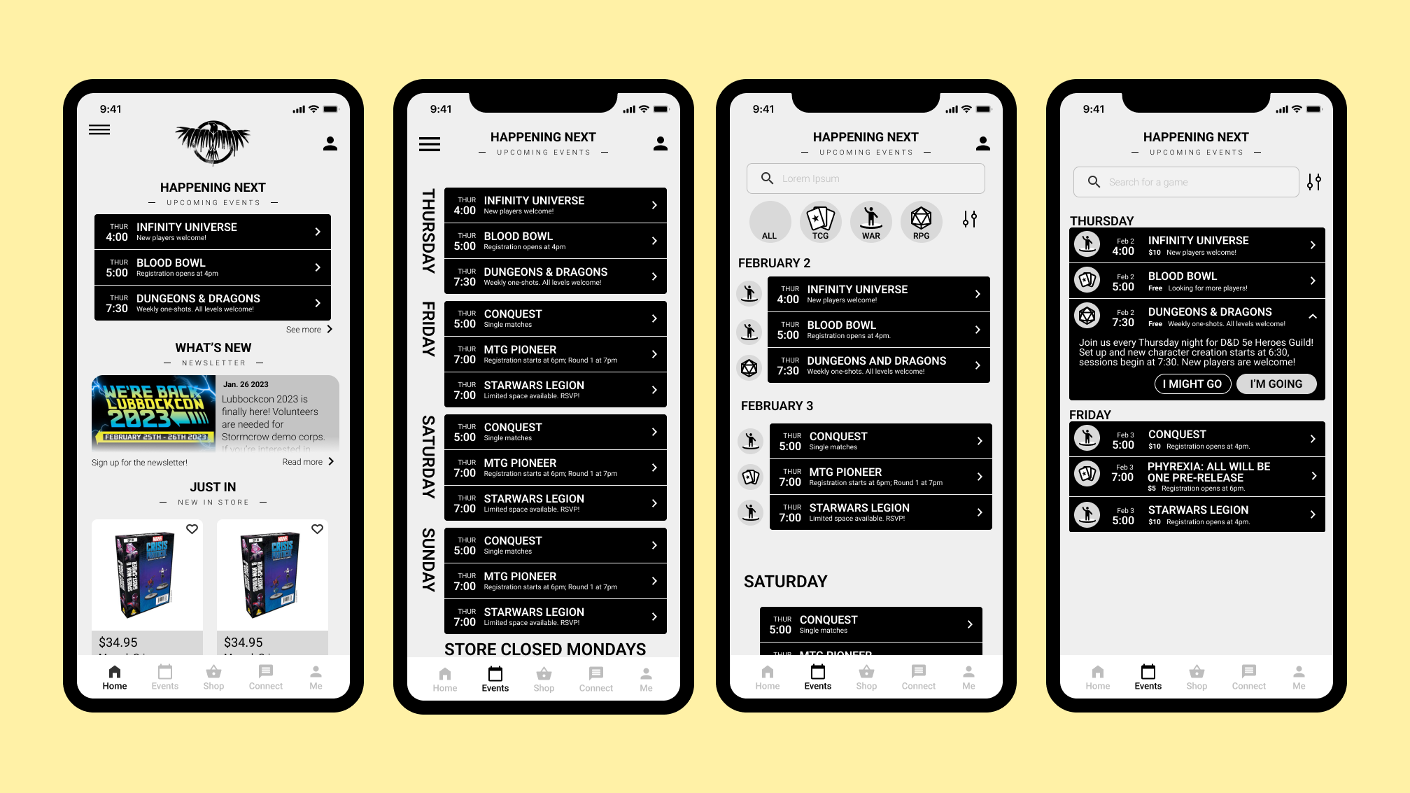
Usability Study
I returned to the store and conducted 6 in person moderated tests. Users were asked to start from the app welcome screen, create an account, locate and RSVP for an event.
“I have large hands, and my fingers have trouble touching these little sections to open the bars” - Participant A
“I like that I can see other people who have RSVP’d for an event, but I wish I could click on their bubble and view their profile.” - Participant B
Findings included:
- Users want more clear access to the full Events listings
- The arrow iconography facing to the right is misleading for the trigger that occurs when pushed
- CTAs were unclear and locating important buttons for flow navigation was difficult
Hi-Fidelity Wireframing & Protoyping
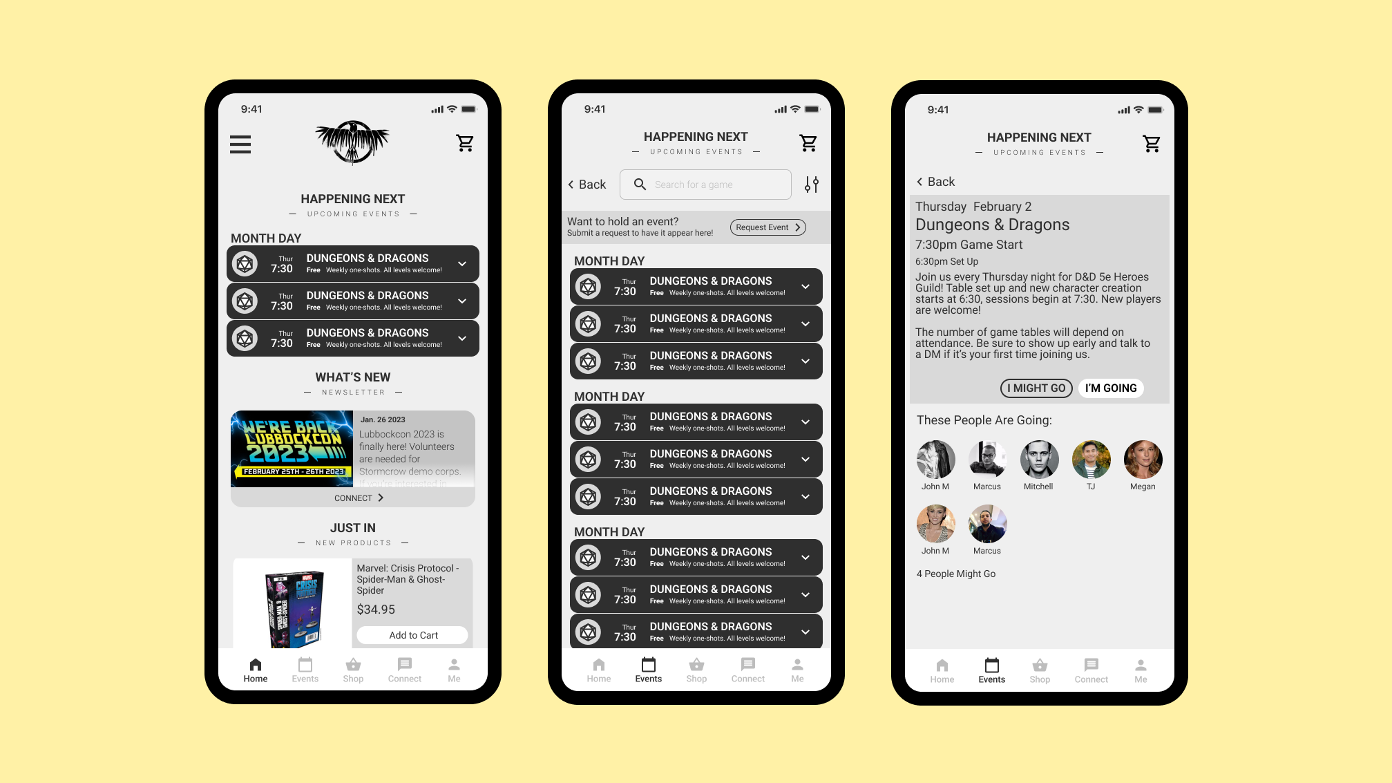
After conducting the moderated tests, usability and visual hierarchy were primary focuses for the next few iterations. Text was overall enlarged, blocks and interactable areas were increased in size and color was used strategically to lead the user through the flow.
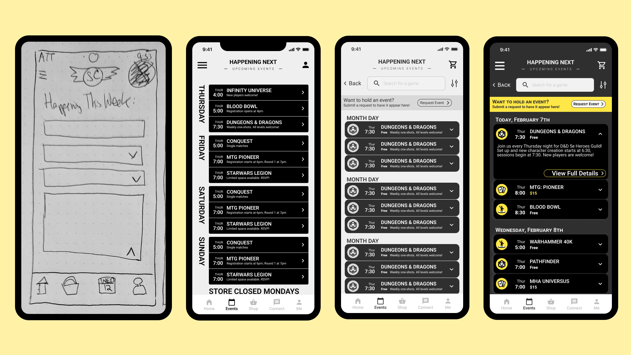
Final Product & Learnings
Working with a real client proved to be much more challenging than previous projects, as a real business is much more complicated and nuanced than example problem prompts. Through the research and testing process, I identified the key pain points between customers and the business, and designed a solution that would benefit both parties.
